Using UB’s Lockups
Our logo and wordmark lockup functions as a discrete element with its own specific considerations. It also acts as our signature, which is why we apply additional rules to ensure its consistent use.
University Communications is responsible for creating and managing all of UB’s lockups. Always use the provided artwork without modification. Do not add, remove or adjust text, or alter the elements in any way.
On this page:
Permitted Master Brand Lockup Colors
The master brand lockup can appear in two colors: UB Blue and White. Black is reserved for use only in cases when color is not an option.
UB Blue


White


Reversed


Black
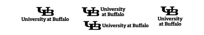

Small-Scale Marks
We have created versions of our lockups specifically for use at small sizes. Please pay close attention to these rules when using our lockups at this scale, in both print and digital applications. There may be times when the lockups appear smaller than the 1-inch configuration, especially if producing merchandise with condensed imprint areas. In these instances, please consult with Trademarks & Licensing before ordering.
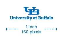
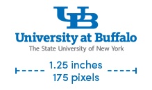
Minimum Sizes
The sizes listed here are the minimum sizes our lockups can appear in any configuration.

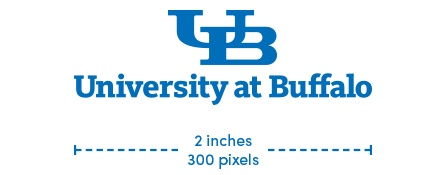
Maximum Sizes
The sizes listed here are the maximum sizes at which our small-scale lockups are permitted to appear. If the lockup needs to be larger than this, use the standard wordmark.


It’s okay to use both versions in the same piece of communication. Just remember to follow the size guidelines listed here.
Always use the small-scale wordmarks for digital applications.
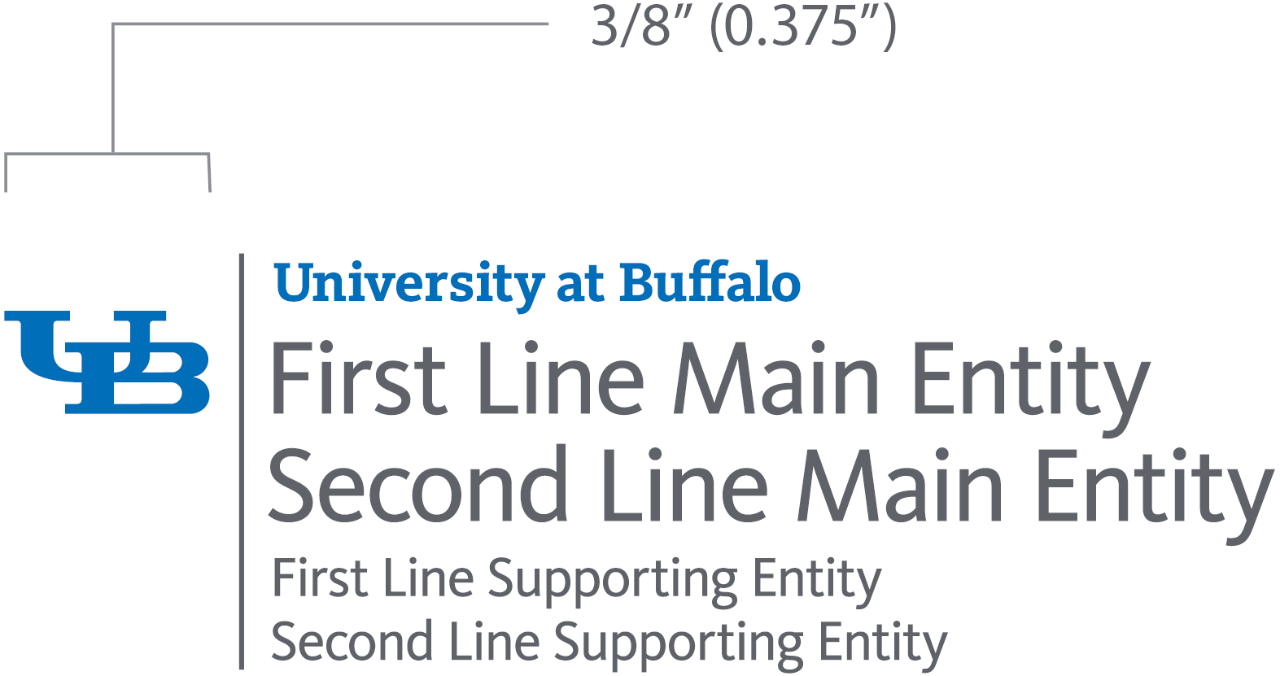
Unit Lockup Construction
University Communications is responsible for creating and managing unit lockups, and is charged with approving any and all usage of university trademarks in promotional instances—University Communications must be consulted prior to ordering promotional items that use these marks.

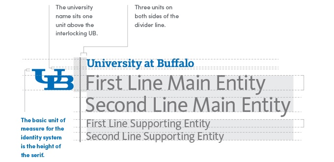
Minimum Unit Lockup Size
The logo lockup must maintain a minimum size in which the width of the interlocking UB is at least 0.375 inch.
Permitted Unit Lockup Colors
Blue and Gray


White (on a solid color)


White (on an image)


Blue


Black


Our Identity and Photography
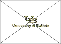
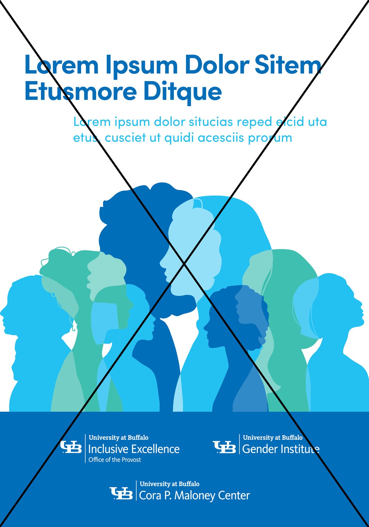
The elements of our identity system should not be placed directly over busy or distracting images.

If you need to use a photographic background, find a calm or neutral area to position the element.

If it’s hard to find a neutral area, create an area of clear space or color where the lockup can sit.
Common Mistakes
It’s important that we be consistent in how we present our identity. Shown here are some common misuses of our lockups. To avoid these, always use the provided artwork without modification.


DON’T change the scale of elements in the identity.


DON’T alter or replace the typefaces in the identity.


DON’T rearrange the elements of the identity.


DON’T stretch, condense, skew, warp, set it on an angle, wrap the identity around a shape or change the dimensions of the identity elements.


DON’T apply drop shadows or other visual effects to the identity.

DON’T change the color of the identity elements beyond the approved colors or replace the solid color with a pattern.

DON’T use the identity in conjunction with typography to form words or phrases.


DON’T add extra elements to the identity.

DON’T place the identity over busy images, patterns, wallpapers or backgrounds.
DON'T show the interlocking UB alone or separated from any official university lockup without a secondary reference.
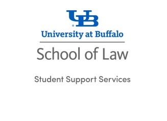
Using Plain Type with Logos and Lockups
Brand extensions and sub-brand lockups are required in all uses. A centered brand extension rather than the standard brand extension, may be used for applications with limited space or size restrictions. On a case-by-case basis, however, units, programs, initiatives or functions may use the master brand mark with the their name in plain text only if the application cannot accommodate the full lockup. The unit, program, initiative or function's name may not appear larger than the university name and must be positioned at least one interlocking UB away from the master brand mark. When the brand extension or sub-brand lockup is not included on the piece, the senior communicator must grant permission of that specific usage in consultation with University Communications’ Brand and Trademarks and Licensing teams.
EXAMPLE:

If a unit, program, initiative or function does not have a lockup, they must use the master brand mark, brand extension or sub-brand mark. If specific representation of that unit, program, initiative or function is necessary, the master brand mark, brand extension or sub-brand lockup can be leveraged with the unit in plain type one interlocking UB away from that mark. This usage requires approval from the senior communicator in consultation with University Communications’ Brand and Trademarks and Licensing teams.
EXAMPLE:


Jacobs School
Given the gift agreement in place for the Jacobs School, all sub-brand and brand extensions from this school must be used as is. If absolutely necessary based on a restrictive application, a unit, program, initiative or function of the school can be shown in plain type one interlocking UB away from the primary brand extension. Senior Communicator approval is necessary in consultation with University Communications’ Brand and Trademarks and Licensing teams.
Plain Type Treatment
The master brand, brand extension, or sub-brand lockups must always be visually dominant over the unit, program, initiative or function’s name shown in plain text. The unit, program, initiative or function's name must be written in full—no abbreviations, short-hand references or ampersands (edu vs education, mgt vs management). See further clarification on institutional unit and program naming standards.
The names of the subsequent offices, units, or entities listed must be shown from smallest to largest, which follows university stationery guidance.
For example:
- Office of Graduate Admissions
- School of Architecture and Planning
- University at Buffalo
Font size of the unit, program, initiative or function cannot be larger than the height of the university name in the mark and must always appear below the mark.
Master Brand Examples:


Centered Brand Extension Examples:


Unit Lockup Examples


Typeface and Weight
Use only Sofia Pro Medium - do not apply all-caps, bold or italic styling. If you do not have a typeface license for the Sofia font family, use Arial Regular.
Text Color Options
UB Blue, White and UB Blue/Gray combination are the preferred colors. Black is reserved for use only in cases when color is not an option.

UB Blue and Townsend Gray

UB Blue

Hayes Hall White


Bulls Black
Representing Multiple Units
If more than one brand extension or sub-brand lockup is represented, please use the university master brand lockup and recognize the units in the plain type treatment as described above. If the sub-brand lockups derive from the same unit, the brand extension may be leveraged and sub-brand units should be reflected in plain type as well.
Additionally, a sub-brand may choose to remove the brand extension and affiliate with the university by displaying the masterbrand mark and the unit or department in plain type only. With this arrangement, the brand extension unit should be clear and it must be pre-approved by the senior communicator.

DO use a single master mark and list units in plain type.
DON'T use multiple unit lockups on a brochure.
Use of University Marks and Name
Neither the university name nor any institutional marks may be locked up or combined with any other design element to create new logos or marks. Specifically:
- It is not permissible to separate the trademarked interlocking UB from the official lockup system and pair it with another graphical or text element.
- It is not permissible to pair any of the following with a graphical or text element:
- The university crest
- The spirit mark (specific applications are granted to UB Athletics, using separate standards)
- Institutional legacy trademarks (e.g., the previous Buffalo Bulls athletics mark)
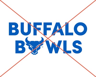
DON'T use the spirit mark, university crest or interlocking UB to replace a letter within a word.
- It is not permissible to use the university crest, spirit mark or interlocking UB to replace a letter within a word.
- The “University at Buffalo” name is also trademarked and tightly governed. As such, it may not be incorporated into, or used in close proximity with, a graphical element in such a way that it could perceived as an alternative logo or institutional mark.
- The University at Buffalo name can be shown on its own in plain type or stylized in merchandise contexts in very limited applications. However, it should not be repeatedly used in this style in such a way that it creates an alternative logo to replace the Masterbrand mark.
- The same rule applies to the #UBuffalo hashtag, which is a trademarked representation of the university name in social media.
Clear space rules must be observed for all protected elements.
Additional naming guidance further restricts the use of our informal academic name, UB, in programs, titles, copy, etc.

