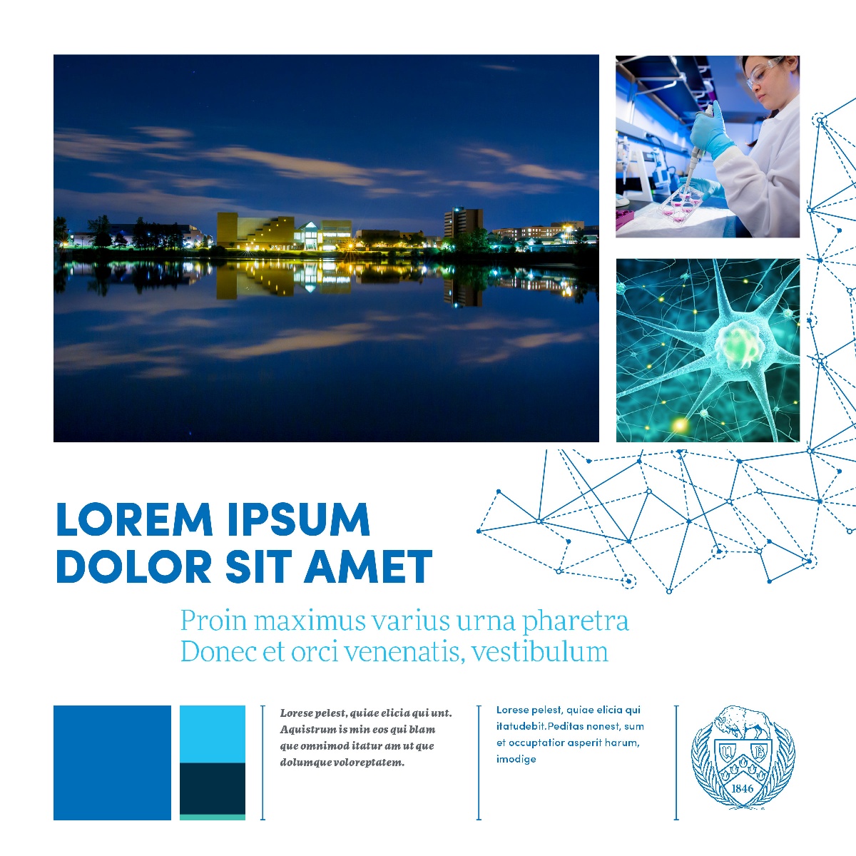
Mood Boards
Wondering how to successfully combine the elements of our brand?
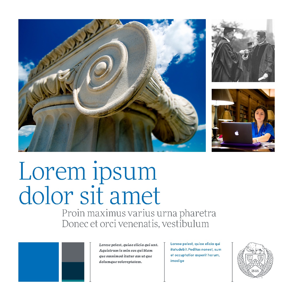
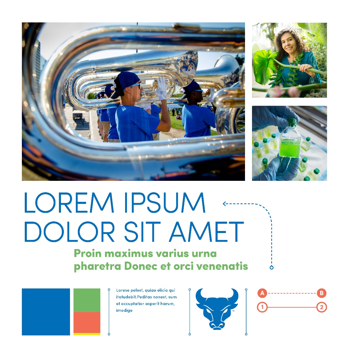
The following mood boards contain a preselected subset of visual elements, combined for range and variety. Any of them can be used as a starting point for crafting unique and focused communications.
These mood boards are not meant to represent specific layouts. They’re simply a collection of elements that work well together, evoking the tone noted in each mood board.
By using color palettes, color ratios, typographic styles and styles of imagery similar to those shown on the following pages, pieces of communication will tend to have the sort of tone assigned to each mood board.
Use these boards in conjunction with the Communication Brief to establish an appropriate look and feel based on your audience and project goals.
Mood board 1:

Mood board 2:

Mood board 3:

Mood board 4:


The University at Buffalo is committed to ensuring digital accessibility for people with disabilities. We are continually improving the user experience for everyone, and applying the relevant accessibility standards to ensure we provide equal access to all users. If you experience any difficulty in accessing the content or services on this website, or if you have suggestions about improving the user experience, please contact:
University Communications at ub-ucom@buffalo.edu or 716-645-6969


