Embroidery Guidelines
The following guidelines are designed to help you create embroidered promotional items using UB’s official names and marks, which helps the public properly identify and associate these products with the university.
On this page:
Please be aware that if embroidery doesn’t fit an imprint area or isn’t legible, you may have to change the logo, choose another product or select a different fabric. Specifically, not all sub-brand lockups can be reproduced due to the length of text and font size. Sew outs (actual embroidery sample on fabric ordered) may be required for each imprint area before production, which will increase production time.
Questions? Contact Cynthia Todd, Director of Trademarks and Licensing at UBTrademarks@buffalo.edu or 716-645-4585.
Thread Colors
If your thread manufacturer is not listed, please contact us at UBTrademarks@buffalo.edu.
EXCEPTIONS: For clinical apparel such as lab coats, official two-color or one-color options in blue or white are allowed depending on the fabric color. For items such as jackets, sweatshirts, etc., black or white thread would also be allowed.
Airplane®
Polyester
Blue #7065
Gray #1401
Alice
Polyester
Blue #1537
Gray #2252
Coats
Polyester
Blue #B126
Gray #1862
Isacord®
Polyester
Nordic Blue #3600
Cobblestone #0108
Madeira
Polyester
Blue #1829
Gray #1741
Marathon®
Polyester
Blue #2193
Gray #2139
Rayon
Blue #1064
Gray #1401
Robison - Anton®
Polyester
GS Gray #5802
Blue #5520
Rayon
Pro Brilliance #2619
Gull #2713
Use Our Brand Typeface
When you are using official UB trademarks, please use our official brand typefaces. For personalization, please use Sofia Pro or Arial.
Official Typeface
Sofia Pro
ABCDEFGHIJKLMNOPQRSTUVWXYZ
abcdefghijklmnopqrstuvwxyz
1234567890 !@#$%^&*()_+[]{}
Substitution Typefaces
Arial is the primary substitution typeface for Sofia Pro. If Arial is not available, a similar sans-serif typeface may be used, but it must be approved by UB Trademarks and Licensing.
Trademark Symbol Requirements
Always use the merchandising versions of UB marks and logos, which have the ® insignia. The ® must be on all logos in the correct position. A dot that represents the ® is okay is in extremely small applications, even if the registration insignia is illegible.
Examples
LOCKUPS

DO use lockups with the correct position of the registered symbol.

DO use lockups with the correct scale of the registered symbol.
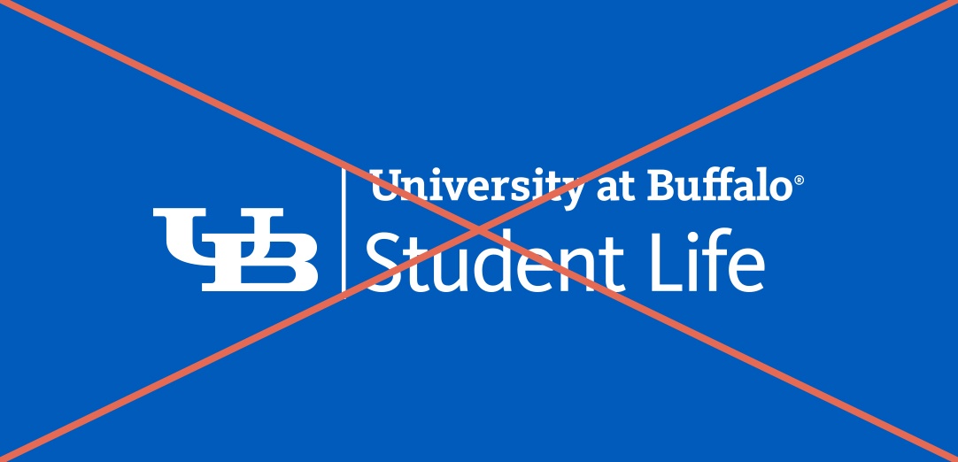
DON’T reposition the registered symbol.
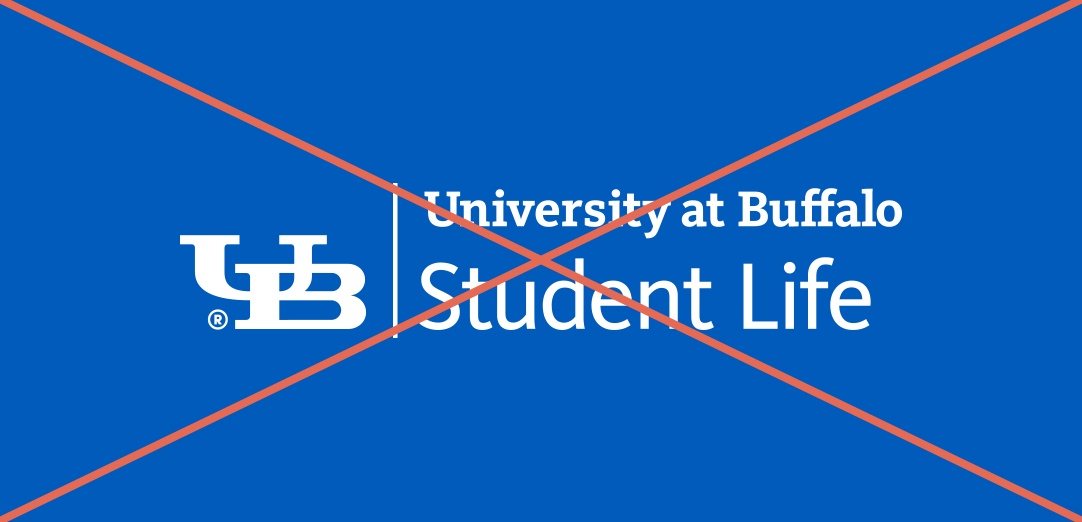
DON’T scale the registered symbol.
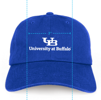
Master Brand Marks

DO use lockups with the correct position of the registered symbol.
DON’T reposition the registered symbol.
Restrictions
To avoid these common misuses, always use the provided artwork without modification.
Lockups

DO use lockups as provided. They are built using specific brand typefaces with typographic nuances.

DO use lockups as provided.

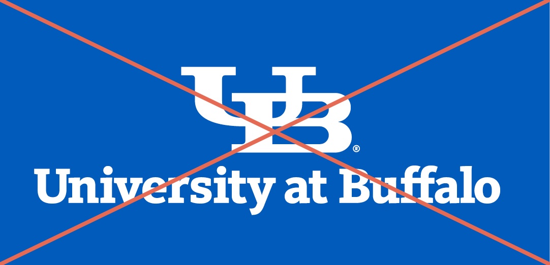
DON’T alter or substitute the brand typefaces. Do not adjust font, point size, weight, line breaks or kerning.

DON’T scale the interlocking UB or any other part of the lockup.
Master Brand Marks

DO use the master brand mark as provided. They are built using specific brand typefaces with typographic nuances.

DO use the master brand mark as provided.
DON’T alter or substitute the brand typefaces. Do not adjust font, point size, weight, line breaks or kerning.
DON’T scale the interlocking UB or any other part of the lockup.
Positioning and Placement
To help standardize the application of the brand identity across the university, the following guidelines should be implemented for all uses of embroidery using lockups. This ensures that correct identification (especially in a clinical setting) and overall recognition of the UB brand is unquestionable. Any exceptions to these guidelines will be granted based on application limitations only, not on historical renderings or personal preference. Exceptions can only be granted by UB Trademarks and Licensing in writing.
Laboratory Coats
Co-Branding on Lab Coats
If a University-recognized program wishes to co-brand lab coats with a hospital or another organization, please contact the Trademarks and Licensing Office to explore your options. This process requires a written agreement between the University and the partnering organization.
The request must come from an officially recognized program (ex. Department of Pediatrics). Faculty, staff or students are not permitted to submit co-branding requests on their own accord.
All co-branded lab coats must comply with the University’s branded merchandise guidelines, including adherence to clear space rules and proper logo usage.
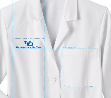
Brand Extension
- The brand extension lockup should be centered on the right chest panel.
- The interlocking UB should always be 13⁄16'' wide no matter which lockup is being used. If the lockup is larger than the imprint area, contact Trademarks and Licensing.
- The baseline of the brand extension logo should always line up with the top of the pocket on the left chest panel.
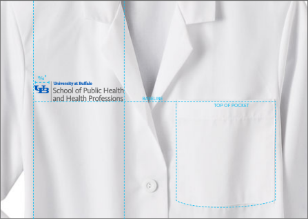

No adjustments are allowed to our logos other than overall size. Do not adjust font, point size, weight, line breaks or kerning.
BRAND EXTENSION WITH SUB-BRAND WRITTEN IN TYPE
- The brand extension lockup should be centered on the right chest panel.
- The interlocking UB should always be 13⁄16'' wide no matter which lockup is being used. If the lockup is larger than the imprint area, contact Trademarks and Licensing.
- The baseline of the sub-brand (department or office name) written in type should line up with the baseline of the top line of the brand extension name and must be in Sofia or Arial Bold in 23pt or with a ¼'' cap-height.
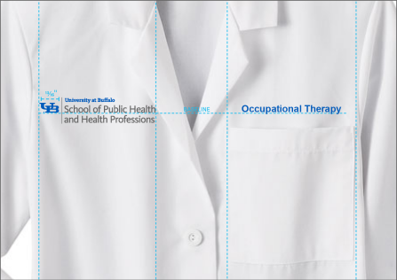

Sew outs may be required prior to trademark approval. Please build extra time and cost into your overall project parameters to meet your deadline.
Collared Shirts
BRAND EXTENSION OR SUB-BRAND LOCKUPS
- The school brand extension or sub-brand logo should be centered on the left chest panel.
- The interlocking UB should always be 13⁄16'' wide no matter which lockup is being used. If the lockup is larger than the imprint area, contact Trademarks and Licensing.
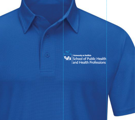

No adjustments are allowed to our logos other than overall size. Do not adjust font, point size, weight, line breaks or kerning.
BRAND EXTENSION WITH SUB-BRAND WRITTEN IN TYPE
- The school brand extension or sub-brand logo should be centered on the left chest panel.
- The interlocking UB should always be 13⁄16'' wide no matter which lockup is being used. If the lockup is larger than the imprint area, contact Trademarks and Licensing.
- The baseline of the sub-brand (department or office name) written in type should line up with the baseline of the top line of the brand extension name.
- The sub-brand (department or office name) written in type must be in Sofia or Arial Bold in 23pt or with a ¼'' cap-height and centered on the left chest panel.
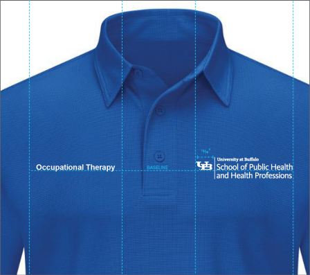

Sew outs may be required prior to trademark approval. Please build extra time and cost into your overall project parameters to meet your deadline.
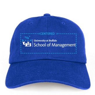
Backpacks and Hats
BRAND EXTENSION OR SUB-BRAND LOCKUPS
- The school brand extension or sub-brand logo should be centered on the front panel/pocket.
- The interlocking UB should always be 13⁄16'' wide no matter which lockup is being used. If the lockup is larger than the imprint area, contact Trademarks and Licensing.

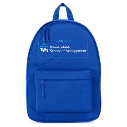

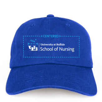
Front
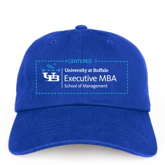

Front
Always check the size of the imprint area before selecting an item for embroidery. If the imprint area is too small, it will result in an undesirable final product.
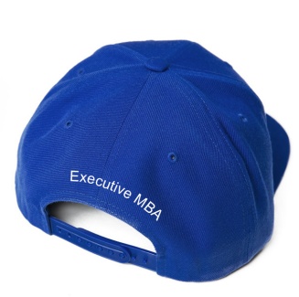
MASTER BRAND MARK WITH BRAND EXTENSION WRITTEN IN TYPE
- The master brand lockup should be visually prominent on the front panel and be at least 3'' wide.
- The brand extension (unit or school name) written in type should be centered on a separate panel and must be in Sofia or Arial Bold in 23pt or with a ¼'' cap-height.

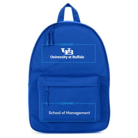

Front


Back
Using the master brand mark with the brand extension in text is permitted. However, the master brand mark cannot be paired with a sub-brand in text, since this would exclude the unit or school that the sub-brand is part of.
BRAND EXTENSION WITH SUB-BRAND WRITTEN IN TYPE
- The school brand extension should be visually prominent on the front panel/pocket.
- The interlocking UB should always be 13⁄16'' wide no matter which lockup is being used. If the lockup is larger than the imprint area, contact Trademarks and Licensing.
- The sub-brand lockup name should be written in type, centered on a separate panel and must be in Sofia or Arial Bold in 23pt or with a ¼'' cap-height.

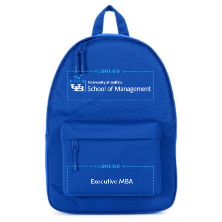

Front

Back
Personalization Specifications
Personalization is not required, but if your school, department or unit requests it, you must follow the layout instructions below. If you are using name tags instead of personalization, please ensure that they are properly branded. For more information, visit the branded name tags page.
Use of Credentials
To ensure program names and credentials are displayed correctly, all credentials must be verified in writing by the senior communicator from your school/department. Students may not display their current program as part of their credentials until the degree/certification has been conferred.
Laboratory Coat
- Personalization should be centered above the pocket on the left chest panel.
- The first line for the person’s name must be in Sofia or Arial Bold in 23pt or with a ¼'' cap-height.
- The second line for the person’s title must be in Sofia or Arial Regular in 18pt or with a 3⁄16'' cap-height.
- One-color stitching should use blue thread. If two-color stitching is requested, then the name should always be in blue and the title should be in gray. See above for thread color options.
- If including the department is necessary, it should appear on a third line.
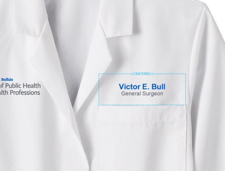

Always use title case for both name and title. Do not use all caps or scripts.
Collared Shirt
- Personalization should be centered on the right chest panel.
- The first line for the person’s name must be in Sofia or Arial Bold in 23pt or with a ¼'' cap-height.
- The second line for the person’s title must be in Sofia or Arial Regular in 18pt or with a 3⁄16'' cap-height.
- One-color stitching should use blue thread. If two-color stitching is requested, then the name should always be in blue and the title should be in gray. See above for thread color options. For dark clothing (as shown), white thread should be used for personalization lettering.
- If including the department is necessary, it should appear on a third line.
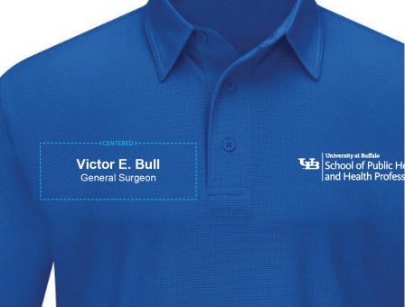

Always use title case for both name and title. Do not use all caps or scripts.
Retail Embroidery Applications
Master brand marks should only be used in retail settings or on donor gifts and are subject to current royalty rates.
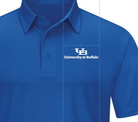
Collared Shirts
- The master brand lockup should be centered on the left chest panel and be at least 3'' wide.

Laboratory Coats
- The master brand lockup should be centered on the right chest panel and be at least 3'' wide.
- The bottom of the master brand lockup should line up with the top of the pocket on the left chest panel.