Using Color to Express Tone
From formal to casual and from muted to vibrant, set the right mood for your communication with our palette.
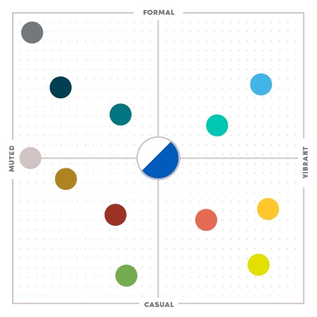
Color chart
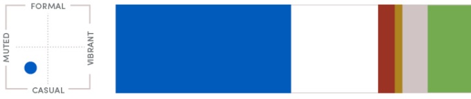
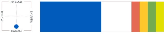
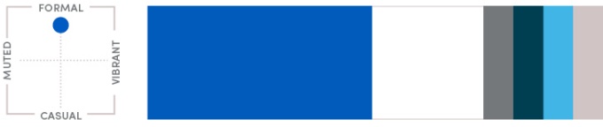
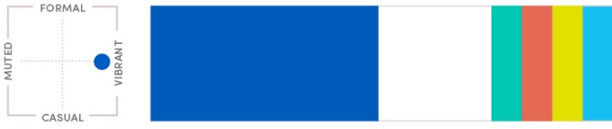
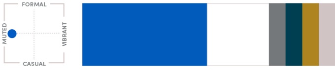
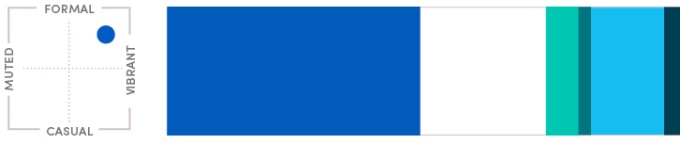
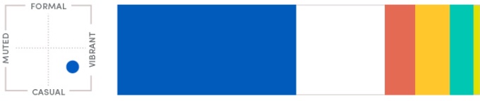
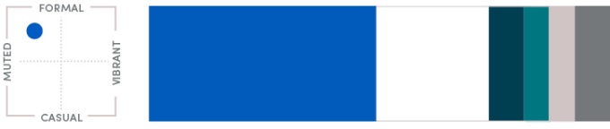
This chart is a guide for understanding the overall tone conveyed by the color combinations within our communications. Colors range from formal to casual and from muted to vibrant. On each sample color palette below, a miniature version of this diagram appears. Use it as a starting point to choose a palette that will project the right mood for your piece.
Ideas
See how the secondary color palette can be applied in a range of successful combinations.
The following examples break down the secondary color palette to show how color combinations can be used successfully to establish a certain tone. Remember, the secondary colors should be used occasionally and sparingly. The primary colors should remain predominant.
Casual

Formal

Vibrant

Muted

Formal-Vibrant

Vibrant-Casual

Muted-Formal

Casual-Muted