Ratios of Color
Follow these guidelines for balancing UB Blue, negative space and the rest of our palette.
Although we have a secondary color palette, our blue and white should be the predominant colors in most layouts. Leading with our heritage colors celebrates the pride we have in our institution’s storied legacy and affords us the opportunity to incorporate a large amount of negative space.
Rather than viewing white space as a blank area, think of it as a pause. Whether it’s in a photo or a layout, don’t rush to fill negative space. What’s absent can focus attention on the content that’s there.
Use the ratios on this page as a guide for balancing UB Blue, negative space and the rest of the palette.
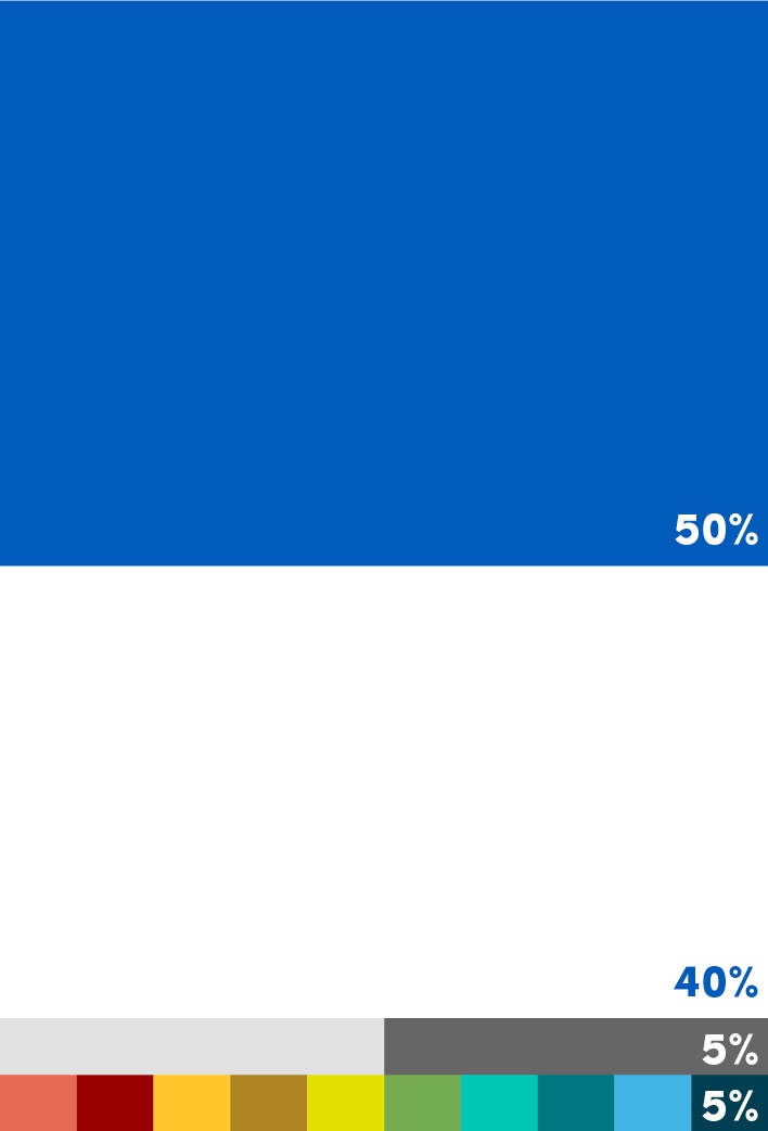
Ratios on individual pages, spreads, layouts and even full communications can vary. The important thing to remember is that UB Blue and Hayes Hall White should be the predominant colors overall. When viewing all the pieces the university creates and applying the “squint test” to the brand as a whole, the balance of color should feel close to what’s seen here.


