Charts and Graphs
Charts and graphs are integral in communicating complex and diverse pieces of data and information. These elements draw on the UB visual identity to maintain consistency through all communications.
On this page:
Accessible Charts
To ensure charts and graphs are compliant with ADA standards, please use alt text to describe the nature or content of the data shown. If a chart is too complex to explain properly through alt text and labels alone, include a written summary with a table and/or key near the chart. Supplement color-coding of graphs and charts with simple patterns to improve accessibility for colorblind users. Charts should be readable in black and white. For more information on these and other accessibility requirements, please reference Microsoft Office's guidelines.
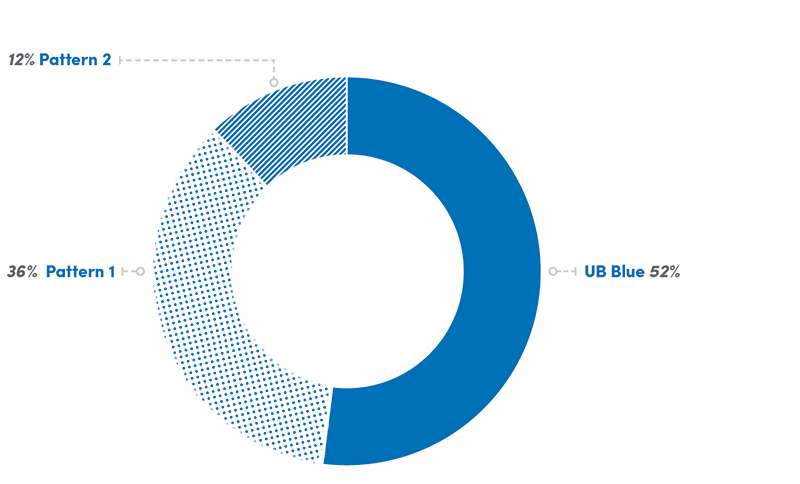
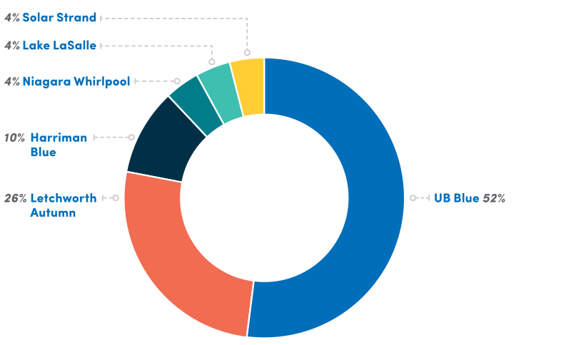
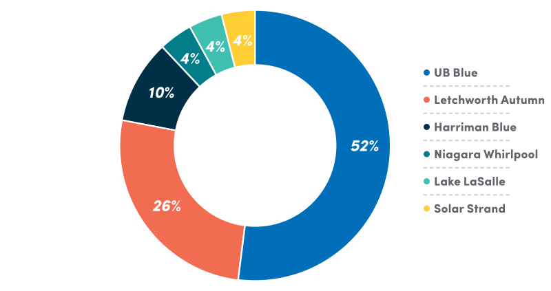
Pie charts
Pie charts are one of the simplest ways to visualize information. Their structure is based on simple logic: The largest piece of the pie should begin at the top of the circle, and the values should follow a descending order around the pie.
Keys can be designed in two ways, as shown here. Note that the hole in the center of the pie should measure about 60 percent of the circle’s diameter.
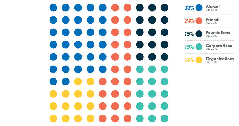
Dot charts
An alternate way to display similar information is with a dot chart. A 10-by-10 grid of dots can be color-coded, with each dot representing one percentage point.
The same logic should follow in that the largest value should start in the upper left corner, with other values following a descending order, clockwise, around the chart.
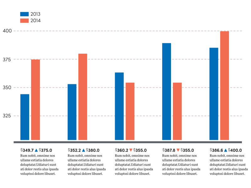
Bar graphs
Bar graphs make it easy to compare multiple sets of data. When creating these graphs within the UB brand, all elements should adhere to the guidelines in this document—fonts, line styles, colors and other elements.
When choosing colors to represent different categories, refer to the following page for acceptable color sets depending on the number of inputs. If you need only two colors, be sure to select a pair with plenty of contrast, like a warm and a cool tone.
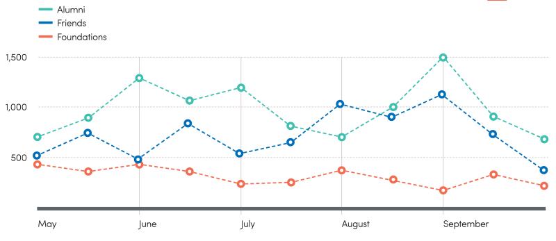
Line graphs
Line graphs are an efficient method of tracking and comparing data over a period of time. As with bar graphs, all elements should adhere to the guidelines in this document.
Whether the lines are solid or dashed, using circles for key milestones creates visual contrast and interest, and makes the values easier to recognize and compare across the board.
Colors should be pulled from the sets listed on the following page, determined by the graph’s overall number of inputs.
Color sequence
Even in charts and graphs, using colors in a common way can go a long way to achieving visual consistency.
As noted in the pie chart section, the largest piece of data should always start at the top of the circle. It should always appear in UB Blue. From there, the values should be listed in descending order, clockwise around the pie, following the color sequence shown at right.
For bar and line graphs, colors should be selected from the sub-palettes below, depending on the number of inputs
for the graph.
The last value listed in the sequence is a 25% tint of Baird Point. This application for charts and graphs is the only exception to the rule prohibiting tints and shades of UB brand colors.